Chapter 5: Virtual Resolution
Lay out once, letterbox onto every device
Here is a small experiment that tells you most of what you need to know about mobile layout. Draw a button sixty pixels wide, forty pixels tall, twenty pixels from the bottom-left corner of the screen. Run it on an iPhone SE — the button is a comfortable size and sits nicely above the bottom edge. Run the same code on a Pixel 8 — the button is now a third of the size it was, relative to the screen, and it has drifted into the gesture bar. Run it on an iPad and it is a postage stamp in the corner of a very large sheet of glass.
Nothing about the code changed. What changed is that "pixel" means something different on every device, and there are now enough different devices that laying out in device pixels is not a strategy at all. It is a promise to fix the layout again for every phone that ships.
The answer used by essentially every 2D game that survives contact with real hardware is to stop laying out in device pixels and lay out in a design space instead: one fixed resolution that you invent, that never changes, and that the renderer maps onto whatever the device actually has. Every chapter in this book draws against 480 × 800 and is correct on every device, and this chapter is about how those two facts are connected.
What you will learn in this chapter
- Why laying out in device pixels does not scale, and why density-independent pixels only half solve it.
- What a design space is, how to choose one, and what makes 480 × 800 a reasonable choice for a portrait game.
- The
Fitcalculation: uniform scale, centring, and the letterbox bars that fall out of it. - How to apply the mapping to drawing with one
Matrixpassed toSpriteBatch.Begin. - How to apply the inverse mapping to touch, so hit-testing works in the same coordinates as layout.
- Why
SamplerState.PointClampmatters when your scale factor is not a whole number. - How to lock an orientation properly — it takes three settings, not one — and when locking is the right design decision rather than the lazy one.
- The three ways to support portrait and landscape at once, and the safe square that makes one design space work in both.
- The alternatives — fill-and-crop, and anchored responsive layout — and when each beats letterboxing.
- The caveats: safe areas and notches, rotation, non-integer scaling, and text legibility on small screens.
The code for this chapter
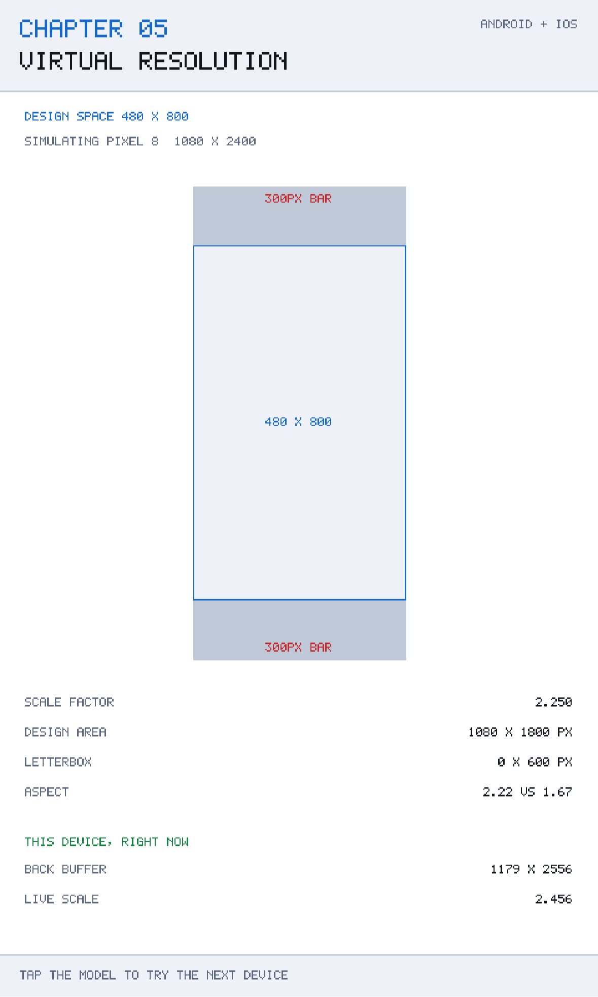
The demonstration is at github.com/nodoid/MonoGameBook/src/Chapter05. It draws a scale model of a chosen device, with the design space and its letterbox bars drawn inside it, and reports the numbers that come out of the fit. Tapping cycles through five device presets — and at the bottom of the screen it also reports the live values for the device the app is actually running on, so you can check the model against reality.
Why device pixels do not work
Consider the range you actually have to support in 2026:
| Device | Resolution | Aspect (h/w) |
|---|---|---|
| iPhone SE (3rd gen) | 750 × 1334 | 1.78 |
| iPhone 15 | 1179 × 2556 | 2.17 |
| Pixel 8 | 1080 × 2400 | 2.22 |
| iPad 10.9" | 1640 × 2360 | 1.44 |
| Older 4:3 tablet | 768 × 1024 | 1.33 |
Two things vary independently, and both matter. The resolution varies by a factor of about three in each dimension, so a fixed pixel size is a different physical size on each. And the aspect ratio varies from 1.33 to 2.22 — a phone is two-thirds again as tall, relative to its width, as a tablet.
Android's answer to the first problem is density-independent pixels: divide by the screen density and you get a unit that is roughly constant in millimetres. That solves physical size, and it is the right model for a forms-based application where content flows. It does not solve the second problem at all, and it is a poor fit for a game, where you usually want the playfield to be the same shape everywhere — an invader formation that is nine columns wide on one phone and eleven on another is a different game, not a responsive one.
What a game usually wants is: the same layout, the same proportions, the same difficulty, on every device. That is what a design space gives you.
The design space
Pick one resolution and declare that it is the world. This book picks:
public const int DesignWidth = 480;
public const int DesignHeight = 800;
From that moment on, every position, size, margin and hit-test in the game is expressed in those units. The ship is at x = 240 because that is the middle. A card is 440 units wide because that is the screen width less a 20-unit margin on each side. Nothing in the game ever asks how big the screen is.
Three things make a design space a good one.
The aspect ratio should be close to your most common device. 480 × 800 is 1:1.67, which sits between the tall modern phone at 1:2.2 and the tablet at 1:1.4. That means neither extreme gets an embarrassing amount of letterbox.
The numbers should be easy to do arithmetic with in your head. You will be positioning things by hand for months. 480 and 800 divide nicely by 2, 4, 5, 8, 10, 16 and 20. 1179 does not.
It should be small enough that a whole-number scale is plausible. A 480-wide design space maps onto a 1080-wide screen at 2.25×, and onto a 960-wide screen at exactly 2×. Design spaces in the thousands of units are always scaled by awkward fractions.
The design space is not a resolution limit. Nothing is rendered at 480 × 800 and then blown up; drawing happens at full device resolution with a scale transform applied. Text drawn at "size 2" in design space is 2 × 2.45 = 4.9 device pixels tall on an iPhone 15. It is coordinates that are virtual, not pixels.
The fit
The whole mapping is one function, and it is worth reading closely because everything else in the chapter is a consequence of it:
public static VirtualViewport Fit(int deviceWidth, int deviceHeight)
{
    float scale = MathF.Min(deviceWidth  / (float)DesignWidth,
                            deviceHeight / (float)DesignHeight);

    int width  = (int)(DesignWidth  * scale);
    int height = (int)(DesignHeight * scale);

    return new VirtualViewport(
        scale,
        (deviceWidth  - width)  / 2,
        (deviceHeight - height) / 2,
        width,
        height);
}
MathF.Min of the two ratios is the key line. Taking the smaller ratio guarantees the design space fits inside the screen in both directions; taking the larger would guarantee it covers the screen and overflows in one. The rest is centring: whatever space is left over is split evenly on the two opposite edges, and those are your letterbox bars.
Work it through for an iPhone 15 at 1179 × 2556:
- horizontal ratio: 1179 / 480 = 2.456
- vertical ratio: 2556 / 800 = 3.195
- scale = min(2.456, 3.195) = 2.456
- scaled size = 1179 × 1965
- offsets = (1179 − 1179) / 2 = 0, and (2556 − 1965) / 2 = 295
So on that phone the design space uses the full width and leaves a 295-unit bar above and below. Those bars are whatever the screen was cleared to — white, in this book's chapters — which is why the screenshots have a margin at top and bottom that the layout never draws into.
And for an iPad at 1640 × 2360:
- horizontal ratio: 1640 / 480 = 3.417
- vertical ratio: 2360 / 800 = 2.950
- scale = 2.950, scaled size = 1416 × 2360, offsets = 112 and 0.
The tablet is limited by height instead of width, so the bars move to the sides. Same function, no special case.
VirtualViewport is a readonly record struct because it is a small, immutable bundle of numbers recomputed whenever the back buffer changes. It also carries the two derived quantities that are worth having on a debug HUD:
public int VerticalBars   => OffsetY * 2;
public int HorizontalBars => OffsetX * 2;
Applying it to drawing
MonoGame makes the drawing half of this almost free. SpriteBatch.Begin takes a transform matrix that is applied to everything in the batch:
transform = Matrix.CreateScale(Scale, Scale, 1f) *
            Matrix.CreateTranslation(offsetX, offsetY, 0f);
inverse   = Matrix.Invert(transform);
public void BeginFrame(Color background)
{
Device.Clear(background);
Batch.Begin(samplerState: SamplerState.PointClamp,
transformMatrix: transform);
}Scale first, then translate. Matrix multiplication is not commutative, and getting these the wrong way round scales your offset as well as your content, which puts everything in roughly — but not quite — the right place, and is a genuinely annoying bug to spot.
After BeginFrame, every drawing call in the game is in design space. A rectangle at (20, 112) with size 440 × 62 is drawn at (20 × 2.456, 295 + 112 × 2.456) with size 1080 × 152 device pixels, and no game code had to know that.
Recomputing when the buffer changes
The back buffer is not constant. It changes on rotation, when a split-screen mode resizes the window, and — irritatingly — sometimes on the very first frame on Android, where the surface is created before the true size is known. The host handles that by checking every frame:
if (GraphicsDevice.Viewport.Width  != lastBackBufferWidth ||
    GraphicsDevice.Viewport.Height != lastBackBufferHeight)
{
    lastBackBufferWidth  = GraphicsDevice.Viewport.Width;
    lastBackBufferHeight = GraphicsDevice.Viewport.Height;
    renderer.UpdateViewport();
}
Two integer comparisons per frame is nothing, and it removes an entire category of "the first frame is laid out wrong" bug that is otherwise very hard to reproduce.
Applying it to touch
This is the half people forget, and it produces the most confusing symptom in mobile game development: everything looks right, and every button is a few dozen pixels away from where it appears to be.
Touches arrive in device pixels. Layout is in design units. So the touch has to be pushed back through the mapping before it can be compared against anything:
/// <summary>Converts a raw touch or mouse position into design-space coordinates.</summary>
public Vector2 ToDesign(Vector2 screenPosition) =>
    Vector2.Transform(screenPosition, inverse);
The inverse was computed once, next to the forward transform, precisely so that the two can never disagree. If you compute the transform in one place and the touch conversion in another — say by dividing by a scale you keep separately — they will drift apart the first time you change one of them.
VirtualViewport carries the same conversion, in a form with no MonoGame dependency, so that it can be unit tested:
public (float X, float Y) ToDesign(float deviceX, float deviceY) =>
    ((deviceX - OffsetX) / Scale, (deviceY - OffsetY) / Scale);
Subtract the offset, then divide by the scale — the exact reverse of scale-then-translate. A touch inside the top letterbox bar produces a negative Y, which is correct and useful: it means the touch was outside the design space, and any Rectangle.Contains test will simply fail, as it should.
The host does this conversion once per touch, per frame, in GatherInput, so no scene ever sees a device pixel:
foreach (TouchLocation location in touches)
{
    Vector2 position = target.ToDesign(location.Position);
    ...
}
That is why every TappedIn(new Rectangle(20, 620, 190, 52)) in this book is correct on every device without a single adjustment.
PointClamp, and why the scale factor is rarely a whole number
Look again at the iPhone 15 numbers: the scale is 2.456. Not 2, not 3. Every design-space pixel maps onto 2.456 device pixels, which means the boundaries of your rectangles land between device pixels.
With the default SamplerState.LinearClamp, the GPU blends across those boundaries, and a one-unit line drawn in design space becomes a slightly blurred two-pixel smear. On the pixel font used throughout this book — where a glyph is five units wide — that is the difference between crisp text and mush.
Batch.Begin(samplerState: SamplerState.PointClamp,
            transformMatrix: transform);
PointClamp takes the nearest texel instead of blending. Edges become hard, and the fractional scale shows up as occasional single-pixel differences in stroke width rather than as blur. For pixel art and for geometric UI, that is almost always the better trade. For photographic sprites and smooth rotation, LinearClamp is better — this is a per-batch choice, and it is legitimate to run two batches with different sampler states.
Snap positions, not just samples
PointClamp fixes sampling. It does not stop a sprite drawn at design-space x = 100.4 from landing on a fractional device pixel. If you see one-pixel jitter on slow-moving objects, round positions to whole design units at draw time — (int)MathF.Round(position.X) — and keep the fractional value in the simulation.
Portrait, landscape, and playing the same game in both
A design space fixes the shape of your layout. It does not decide which way up the shape is, and that is a separate decision you should make deliberately and early, because it is expensive to change once you have positioned a few hundred things.
There are three honest answers, and only three.
Lock the orientation
This is what every chapter in this book does, and for most games it is the right answer rather than the lazy one. A game's layout is part of its design: an invader formation eight columns wide and five rows deep is a portrait shape, and a twin-stick shooter is a landscape one. Rotating either does not produce the same game in a different frame; it produces a different game.
Locking takes three settings, and all three are needed — miss one and the app rotates anyway on some device you do not own.
In the game host, so MonoGame does not try to follow the sensor:
graphics = new GraphicsDeviceManager(this)
{
    IsFullScreen = true,
    SupportedOrientations =
        DisplayOrientation.Portrait | DisplayOrientation.PortraitDown,
    PreferredBackBufferWidth = Renderer.DesignWidth,
    PreferredBackBufferHeight = Renderer.DesignHeight,
};
In the Android head, on the activity, so the system does not rotate the window underneath you:
[Activity(
    ScreenOrientation = ScreenOrientation.Portrait,
    ConfigurationChanges =
        ConfigChanges.Orientation |
        ConfigChanges.ScreenSize |
        ...)]
And in the iOS head's Info.plist, once for phones and once for tablets, because iPad reads the second key and will happily ignore the first:
<key>UISupportedInterfaceOrientations</key>
<array>
  <string>UIInterfaceOrientationPortrait</string>
  <string>UIInterfaceOrientationPortraitUpsideDown</string>
</array>
<key>UISupportedInterfaceOrientations~ipad</key>
<array>
  <string>UIInterfaceOrientationPortrait</string>
  <string>UIInterfaceOrientationPortraitUpsideDown</string>
</array>
Lock it in all three places or in none
The commonest orientation bug is a game that is locked on Android and free on iPad, because the ~ipad key was never added. The second commonest is a game locked in the manifest but not in GraphicsDeviceManager, which produces a back buffer that briefly reports the wrong way round on the first frame.
Support both with two design spaces
If the game genuinely plays in either orientation, the clean approach is to have two design spaces and to choose between them when the viewport changes:
public const int PortraitWidth = 480;
public const int PortraitHeight = 800;
public const int LandscapeWidth = 800;
public const int LandscapeHeight = 480;

public static VirtualViewport Fit(int deviceWidth, int deviceHeight)
{
    bool landscape = deviceWidth > deviceHeight;
    int designWidth = landscape ? LandscapeWidth : PortraitWidth;
    int designHeight = landscape ? LandscapeHeight : PortraitHeight;

    float scale = MathF.Min(deviceWidth / (float)designWidth,
                            deviceHeight / (float)designHeight);
    ...
}
Everything in this chapter still works: Fit returns the same scale and offset, SpriteBatch gets the same matrix, touches invert through the same inverse. What changes is that every scene now has two layouts, and both have to be maintained. That is the real cost, and it is a large one — it is why so many mobile games simply lock.
If you take this route, keep the rules in Core free of layout entirely, which the architecture from Chapter 1 already pushes you towards. A Sudoku board is nine by nine in both orientations; only where the digit pad goes changes.
Support both with one design space and a safe square
The middle road, and usually the best value. Pick one design space that is taller and wider than the region the game actually needs, and guarantee that everything essential lives inside a square in the middle of it:
public const int DesignWidth = 800;
public const int DesignHeight = 800;

/// <summary>Everything the game needs to play is inside this.</summary>
public static readonly Rectangle SafeSquare = new(0, 0, 800, 800);
In portrait, letterboxing an 800 × 800 space onto a 1080 × 2400 screen scales by 1.35 and leaves generous bars top and bottom. In landscape on the same device it scales by 1.35 as well, and leaves the bars at the sides instead. The playfield is identical either way, and it is the margin that moves.
Then put the HUD in the margin. A score bar and a pause button anchored to the real screen edges — not to the design space — appear above and below in portrait and left and right in landscape, and the game in the middle never notices. That anchoring is the one place a game legitimately mixes design-space layout with real-screen layout, and it is why VirtualViewport exposes OffsetX, OffsetY, Width and Height rather than only the scale.
The rule to hold on to is this:
Gameplay goes in the square. Chrome goes in the margin. Nothing important goes where the margin might not be.
Handling the rotation itself
If you do support both, the mechanics are already in place from earlier in this chapter, and there are only two things to get right.
Recompute the viewport when the back buffer changes. The host already does this every frame with two integer comparisons, so a rotation is picked up on the frame it happens:
if (GraphicsDevice.Viewport.Width  != lastBackBufferWidth ||
    GraphicsDevice.Viewport.Height != lastBackBufferHeight)
{
    lastBackBufferWidth  = GraphicsDevice.Viewport.Width;
    lastBackBufferHeight = GraphicsDevice.Viewport.Height;
    renderer.UpdateViewport();
}
Do not let the activity be destroyed. On Android, a rotation recreates the activity — disposing the graphics device and your game with it — unless ConfigurationChanges lists Orientation and ScreenSize. Chapter 1 set both, and this is the case they were set for.
Touch needs no work at all. The inverse matrix is rebuilt alongside the forward one in UpdateViewport, so a tap lands in the right design-space coordinate the moment the new viewport is computed.
And the case neither answer covers
On an iPad in Split View or Slide Over, and on an Android device in multi-window, your window is not portrait or landscape — it is an arbitrary rectangle that the user can drag to any size while your game is running, including sizes with an aspect ratio no phone has ever had.
A locked orientation does not protect you from this; UIRequiresFullScreen in Info.plist does, and it is what this book's chapters set:
<key>UIRequiresFullScreen</key>
<true/>
If you allow multitasking, the safe-square approach is the only one of the three that survives it, because it makes no assumption about which way the margin runs. Test by dragging the divider slowly: anything that pops, clips or re-lays-out mid-drag will do the same on a real user's screen.
The alternatives
Fill and crop
Take MathF.Max instead of MathF.Min and the design space covers the screen with no bars, overflowing off two edges. Nothing is letterboxed; something is lost.
This is the right choice for a game whose background is a scrolling world where the edges do not matter — a runner, a top-down shooter with a tiling backdrop. It is the wrong choice for anything with UI near an edge, because on the tallest phone you will lose about a fifth of your design height, and whatever was there is simply gone.
A common hybrid is to fill-and-crop the world and letterbox the UI: two batches, two matrices, one Begin/End pair each.
Anchored responsive layout
The other extreme is to stop having a design space at all and lay out relative to the real screen: this button is anchored 5% from the bottom, this panel is 90% of the width, this font is 4% of the screen height. This is what a UI framework does, and for a menu-heavy application it is better than letterboxing.
It costs you the guarantee that the game is the same shape everywhere, and it makes every position a calculation rather than a number, which in a game with hundreds of positioned elements is a lot of arithmetic to get wrong. It is also very hard to test, because there is no single canonical layout to compare against.
The pragmatic middle ground — and the one most shipped 2D games use — is a fixed design space for the playfield, with a small number of UI elements anchored to the real edges so they respect safe areas. Which brings us to the caveats.
Caveats
Letterboxing does not solve safe areas
This is the important one. On a modern phone, the bars are usually at the top and bottom, and the notch and home indicator are in the bars — so the design space is untouched and everything is fine. But on a device whose aspect ratio is close to your design ratio, the bars are thin or absent, and the home indicator sits on top of your content.
Do not assume the bars protect you. Keep a safe margin — 40 design units at top and bottom is a reasonable default — free of anything interactive. The chapter apps in this book keep a 74-unit header and a 34-unit footer for exactly this reason, and neither contains a tap target.
Very small screens
A design space is uniform, so text that is legible at 480 × 800 on an iPhone 15 is legible on an iPhone SE too, in relative terms — but the SE is a physically smaller screen, so the text is physically smaller. Below about 4.7 inches, check your smallest text on hardware. A 5 × 7 pixel font at scale 1 on an SE is about 1.9 mm tall, which is legible but not comfortable.
Integer truncation in the fit
(int)(DesignWidth * scale) truncates, so the scaled area can be one pixel short of the screen, and the offsets — computed with integer division — can leave a one-pixel sliver on one edge. It is invisible while the bars and the background are the same colour, which they are here, and it is worth knowing about the moment you draw the two differently.
The bars are your game's colour
Whatever the screen was cleared to shows through in the bars. Device.Clear(background) runs before the transform is applied, so the clear colour fills the whole back buffer, bars included — which is why the bars in this book are the same white as the pages. If you want the bars to differ from the playfield, clear to the bar colour and then draw a background rectangle over the design area.
Building and running this chapter
The solution is src/Chapter05/Chapter05.sln in the book's repository at github.com/nodoid/MonoGameBook/src/Chapter05. It builds and runs entirely on its own; nothing in it depends on any other chapter having been read or built.
Build either head from the chapter folder:
cd src/Chapter05
dotnet build Android/Chapter.Android.csproj
dotnet build iOS/Chapter.iOS.csproj
To deploy to a connected Android device or a running emulator:
dotnet build Android/Chapter.Android.csproj -t:RunTo run on the iOS Simulator without opening an IDE, build for the simulator runtime and install the bundle by hand:
dotnet build iOS/Chapter.iOS.csproj -p:RuntimeIdentifier=iossimulator-arm64
xcrun simctl install booted \
  iOS/bin/Debug/net10.0-ios/iossimulator-arm64/Chapter05.iOS.app
xcrun simctl launch booted com.monogamebook.chapter05
Everything the chapter demonstrates is reachable by touch on the first screen; there are no menus to navigate and nothing to load.
Try it yourself
- Run the chapter app and cycle through all five presets. Note that "OLD 4:3" is the only one where the bars are on the sides, and work out why from the ratios.
- Compare the live "BACK BUFFER" and "LIVE SCALE" values at the bottom against the preset that matches your device. They should agree exactly.
- Change
DesignWidth/DesignHeightto 540 × 960 and rerun. Every chapter still lays out correctly, because nothing is hard-coded to 480 — only the bars change. - Change
MathF.MintoMathF.MaxinFitand rerun the chapter app. The bars disappear and the model overflows; decide whether your own game could live with that. - Change
SamplerState.PointClamptoLinearClampinRenderer.BeginFrameand look closely at the text on a real device. - Remove
ScreenOrientation.Portraitfrom the Android activity but leave the other two orientation settings in place, then rotate the device. Note which of the three settings was actually holding the layout still. - Make the design space 800 × 800, allow all four orientations, and put a HUD bar anchored to
viewport.OffsetYrather than to the design space. Rotate, and watch the playfield stay put while the bar moves.
Summary
Device pixels are not a coordinate system you can lay out in, because resolution varies by a factor of three and aspect ratio varies by nearly a factor of two. Density-independent pixels fix the first problem and not the second, and the second is the one that changes how a game plays.
A design space fixes both by inverting the question. You declare one resolution — 480 × 800 here — and lay out everything in it, forever. A single Fit function takes the smaller of the two device-to-design ratios, centres the result, and hands back a scale and an offset. Multiply into a Matrix and pass it to SpriteBatch.Begin, and all your drawing is in design space. Invert the same matrix and push touches back through it, and all your input is too.
The costs are two letterbox bars and a scale factor that is rarely a whole number. SamplerState.PointClamp deals with the second. The bars are usually a bonus rather than a cost on modern phones, because they hold the notch and the home indicator — but they are not a substitute for keeping a genuine safe margin, and on a device whose aspect ratio matches your design space there are no bars at all.
Orientation is a separate decision and a deliberate one. Locking takes three settings — SupportedOrientations on the graphics device manager, ScreenOrientation on the Android activity, and both UISupportedInterfaceOrientations keys in the iOS plist — and for a game whose layout is part of its design, locking is the honest answer rather than the lazy one. If you do support both, the cheapest approach that survives iPad multitasking as well is a single design space with a safe square: gameplay in the square, chrome anchored in the margin, and nothing important where the margin might not be.
Everything from here on in this book assumes this chapter. When Chapter 18 says a Sudoku cell is 44 units square and that this is a comfortable thumb target, that number is only meaningful because 44 units means the same physical thing on every phone.
Chapter 6 takes the other half of the input story. Now that a touch arrives in the right coordinate system, what do you do with a stream of them — and how do you turn raw touch points into a tap, a drag and a swipe?